BrainBlog for Inapps.net by Jason English
As a young Information Architect in the earliest of web interactive agencies, I greedily absorbed any good examples of data visualization I could find, from the coffee-table sized Edward Tufte series of books, to novel representations of quantities and events in classic video games like Railroad Tycoon and Civilization.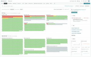
Delivering a good summary view that surfaced the most relevant aspects of underlying data for users was a challenging enough job when monitors were low resolution and connectivity was low bandwidth. But the flow and quantity of data we’re grappling with today would have been unfathomable back then — not just in terms of throughput and system capacity, but from a human factors perspective. How could I expect end users to make sense of all this data?
Data visualization involves designing and engineering a human-computer interface, or metrics dashboard, to allow better human cognition and analysis of data atop live data streams and archived data.
While the concept of data visualization is quite mature by now in business and scientific analytics circles, the intuitive display of ever-expanding quantities of data still offers plenty of room for innovation in the software observability space.
Good data visualization is the critical bridge to making the near-unlimited operational and application data consumed by observability solutions understandable and actionable on the part of humans, and ultimately improve customer experience.
Read the entire BrainBlog here.